Creating an athletics logo that stands out in the competitive world of sports and fitness branding requires more than just an eye-catching design because it involves a deep understanding of the brand’s identity for the target audience, and the latest design trends. Whether you are developing a logo for a sports team, a fitness brand, or an athletic event, your logo will serve as a powerful visual representation of the values and spirit you wish to convey. In this guide , we’ll explore what makes an athletics logo truly exceptional, key design elements to consider for your business, and the latest trends that can help your logo resonate with its intended audience.
What Makes an Athletics Logo Stand Out?
An effective athletics logo should be bold, memorable, and instantly recognizable. The best logos in the sports and fitness industry are those that evoke a sense of strength, agility, and determination—qualities that are essential in athletics. Here are some key elements that can help your athletics logo stand out:
Simplicity
One of the most critical aspects of logo design is simplicity. A simple design is often more impactful than a complex one, as it is easier to recognize and remember. For instance, the Athleta logo is a great example of simplicity done right. The clean, minimalistic design reflects the brand’s focus on empowering women through fitness and activewear. Similarly, the Athletic Greens logo uses a straightforward design that effectively communicates the brand’s association with health and wellness.
Versatility and resourcefulness
A successful athletics logo should be versatile enough to look great across various platforms and applications. This includes everything from apparel and merchandise to digital media and print. To achieve this, consider creating your logo in a vector format, which allows it to be scaled to any size without losing quality. Additionally, providing an athletics logo with a transparent background can offer greater flexibility in terms of placement, whether on a website, social media, or promotional materials.
Memorability
The most effective logos are those that leave a lasting impression on viewers. A memorable logo can help build brand recognition and loyalty over time. The cheer athletics logo is a prime example of a memorable design. Its unique and dynamic design elements make it instantly recognizable, helping to reinforce the brand’s identity and values.
Relevance
Your athletics logo should be relevant to the brand or organization it represents. This means incorporating design elements that reflect the spirit and energy of athletics. For example, a logo for a brand targeting female athletes, like the athletic girl logo, should include elements that convey empowerment, strength, and femininity. Similarly, a logo for a youth sports team might incorporate playful and energetic elements to appeal to a younger audience.
Key Elements of an Effective Athletics Logo
Designing an athletics logo involves careful consideration of various elements, each of which plays a crucial role in the overall impact of the logo. Here are some key elements to consider:
Color
he colors you choose for your athletics logo can significantly influence how it is perceived. Different colors evoke different emotions and associations. For example, green is often associated with health, vitality, and nature, making it a popular choice for brands like Athletic Greens. On the other hand, bold colors like red, blue, and black are frequently used to convey energy, power, and strength. When selecting a color palette, consider the psychological impact of each color and how it aligns with your brand’s identity.
Typography
Typography is another critical element of logo design. The font you choose can convey a lot about your brand’s personality and values. For athletics logos, bold and strong fonts are often preferred as they convey power, confidence, and determination. Experimenting with different athletics logo fonts can help you find the perfect balance between readability and impact. Additionally, consider customizing your typography to create a unique and distinctive look for your logo.
Imagery and Symbols
Adding imagery and symbols into your athletics logo can help communicate the essence of your brand or team. This could include anything from a stylized icon of an athlete in motion to a more abstract representation of speed, strength, or agility. Custom illustrations can add a personal touch to your logo and set it apart from competitors. However, it’s essential to ensure that any imagery used is relevant and aligns with your brand’s
Shape and Structure
The overall shape and structure of your logo can also impact its effectiveness. A well-balanced logo with a clear and cohesive structure will be easier to recognize and remember. Consider using geometric shapes or symmetrical designs to create a sense of harmony and balance. Additionally, ensure that your logo is scalable and works well in both small and large sizes.
Adaptability
In today’s digital age, it’s essential for your athletics logo to be adaptable across various platforms and mediums. This includes everything from websites and social media to merchandise and promotional materials. An athletics logo in vector format is ideal for ensuring that your logo maintains its quality and integrity, regardless of size or application. Additionally, offering a transparent version of your logo allows for greater flexibility in terms of background placement.
Modern Trends in Athletics Logo Design
As with any design field, logo design trends are constantly evolving. Staying up-to-date with the latest trends can help ensure that your athletics logo remains relevant and resonates with your target audience. Here are some of the current trends in athletics logo design:
Minimalist Design
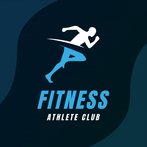
Minimalism continues to be a popular trend in logo design, and for good reason. By stripping down to the essentials, minimalist logos are not only modern and sleek but also timeless. A transparent athletics logo that uses simple shapes and lines can achieve a clean, contemporary look that appeals to a wide audience.
Bold Typography
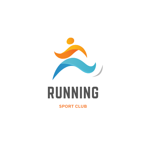
Typography is playing an increasingly prominent role in logo design. Bold, strong fonts are being used to convey power and confidence, which are essential qualities in the world of athletics. Incorporating custom or unique athletics logo fonts can add a distinctive touch to your design and help it stand out from the competition.
Custom Illustrations
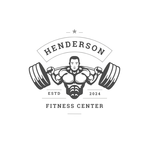
Adding unique, custom illustrations to your logo can help differentiate your brand and create a memorable visual identity. Whether it’s a dynamic silhouette of an athlete or a stylized icon that represents speed or agility, custom illustrations can add personality and character to your logo.
Vintage Revival
Many brands are embracing retro aesthetics, drawing inspiration from classic sports logos. This trend adds a nostalgic touch, which can be particularly appealing to older audiences or those with a love for vintage design. A vintage-inspired athletics logo can evoke a sense of tradition and history, which can be powerful in building brand loyalty.
Color Gradients and Effects
While flat designs have been popular in recent years, there is a growing trend towards incorporating color gradients and effects into logo designs. These elements can add depth and dimension to your logo, making it more visually interesting. However, it’s essential to use these effects sparingly to ensure that your logo remains clean and professional.
Examples of Iconic Athletics Logos
To gain inspiration for your athletics logo, it’s helpful to look at examples of iconic logos in the sports and fitness industry. Here are a few standout examples:
Athleta Logo
The Athleta logo is a great example of simplicity and elegance in design. The clean, minimalistic design reflects the brand’s focus on empowering women through fitness and activewear. The logo’s simplicity also makes it versatile and adaptable across various platforms and applications.
Cheer Athletics Logo
The Cheer Athletics logo is a dynamic and energetic design that captures the excitement and spirit of cheerleading. Its vibrant colors and unique design elements make it instantly recognizable, helping to reinforce the brand’s identity and values.
Athletics Greens Logo PNG
The Athletic Greens logo is a simple yet effective design that effectively communicates the brand’s association with health and wellness. Its clean and straightforward design makes it versatile and adaptable, whether used on digital platforms or physical products.
Conclusion
Wither you are a designer or sports person want to Design an athletics logo which requires a careful balance of creativity and strategies, this will help you in understanding of current trends. Whether you’re looking to create the best athlete logo or redesigning an athletics new logo, it’s essential to keep the key elements of effective logo design in mind. By focusing on simplicity, versatility, memorability, and relevance, you can create a logo that not only looks great but also resonates with your target audience.
Adding the latest design trends, such as minimalism, bold typography, custom illustrations, and vintage revival, can help ensure that your athletics logo remains modern and relevant. Additionally, paying attention to the details, such as color palette, typography, imagery, and adaptability, can make a significant difference in the overall impact of your logo.
By following these guidelines and drawing inspiration from iconic athletics logos, you’ll be well on your way to creating a logo that stands out in the competitive world of sports and fitness branding. Remember, your logo is more than just a symbol—it’s a powerful visual representation of your brand’s identity, values, and spirit.


